RYAN NUSSBAUM/
UX & BRAND DESIGN
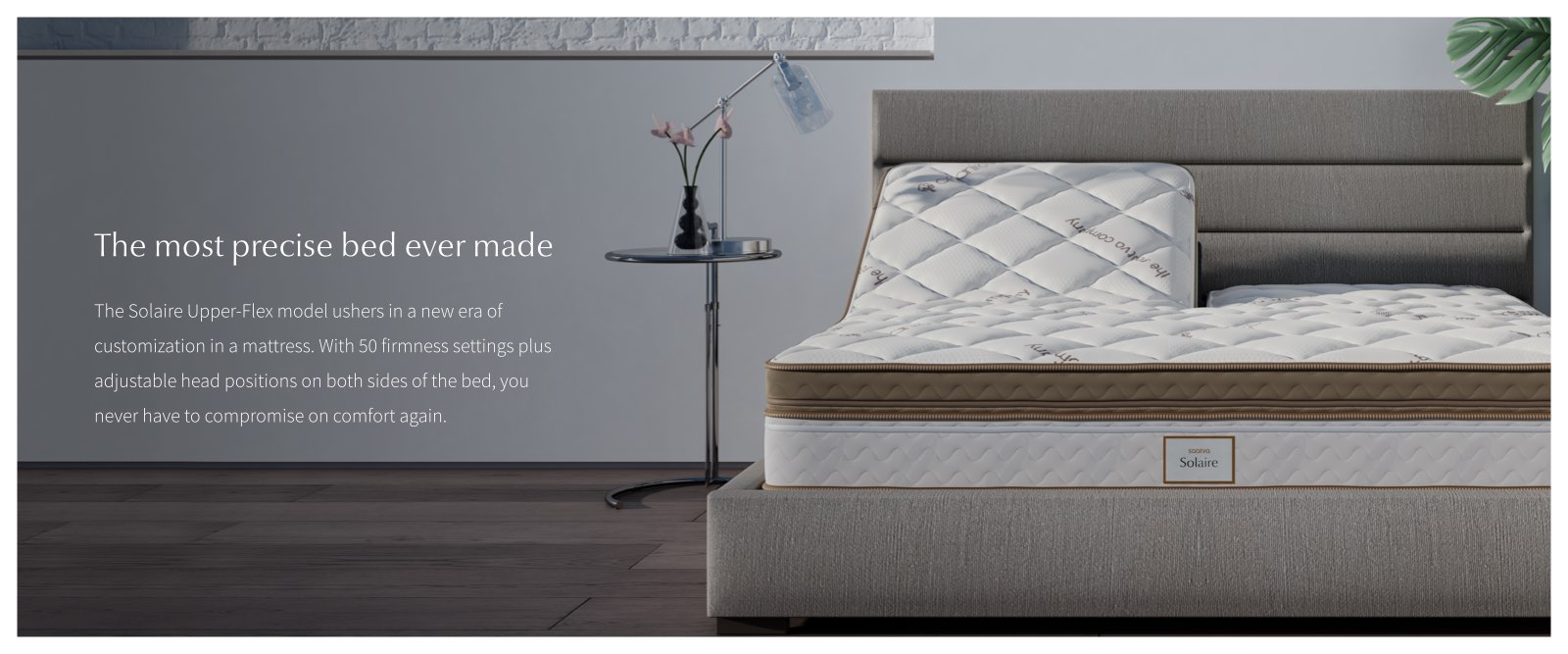
Solaire Mattress
The Solaire, launched in April 2019, is Saatva’s 4th mattress and is comparable to Sleep Number. With 50 firmness settings, users can customize their comfort level to their preference. My team had one quarter to design and build an experience on Saatva.com. The tight timeline necessitated lean user research and consistent releases to engineering. Considering our competitor, we knew the site experience would need to work extra hard to both educate and convert users.
Role: Director of UX
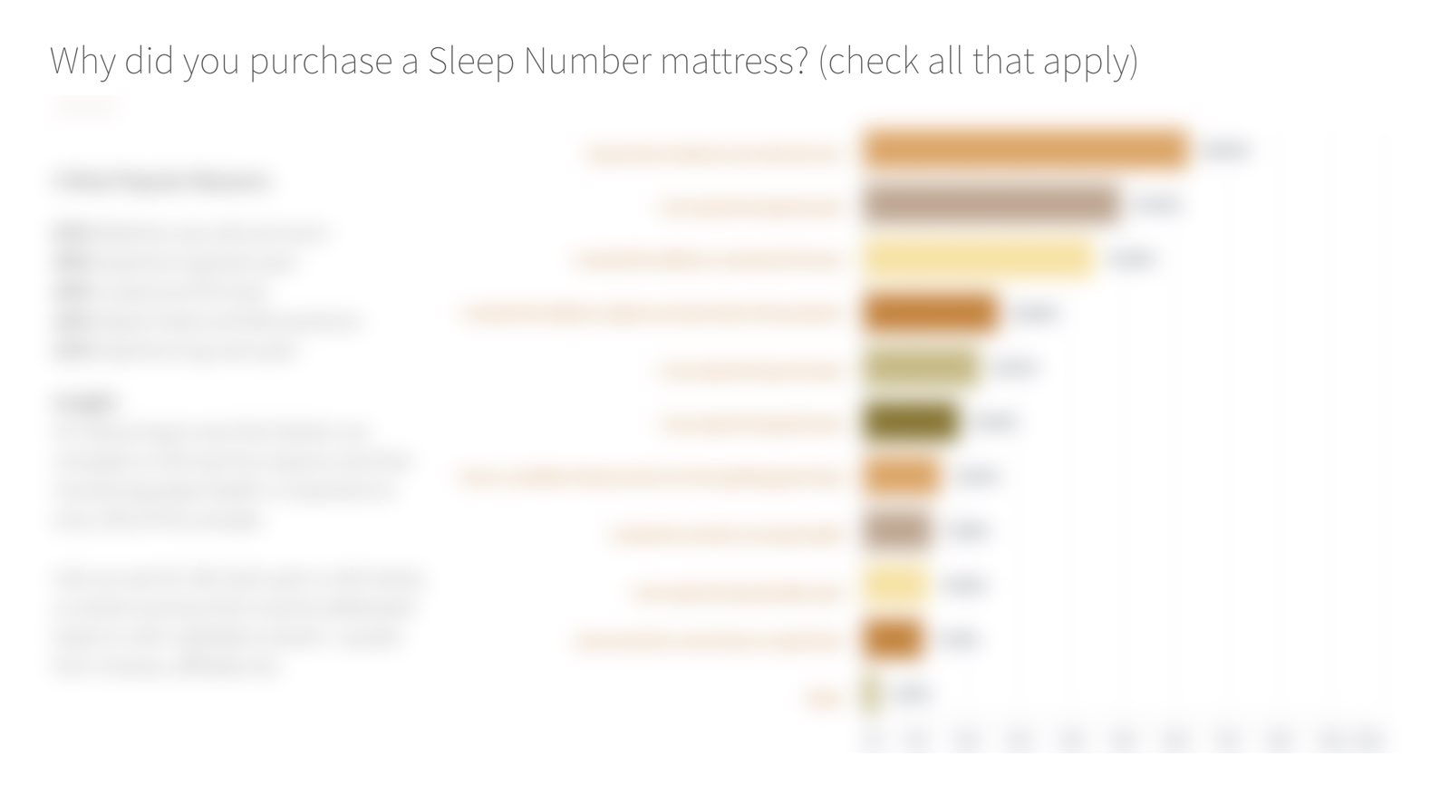
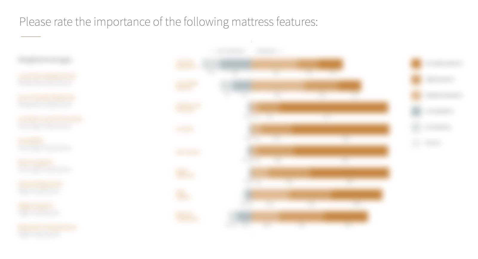
User Research
Our goal was to understand the needs and pains of our potential customers to inform UX decisions. We decided a survey was the best way to get broad quantitative data quickly. We would then follow up with one-on-one interviews to fill in the gaps. The qualifying criteria was narrow: survey respondents must have purchased a Sleep Number mattress within the last year.
Whiteboarding and Rapid Sketching
We gathered stakeholders from each department into the room and completed rapid sketching sessions to go over mattress construction and every possible configuration.
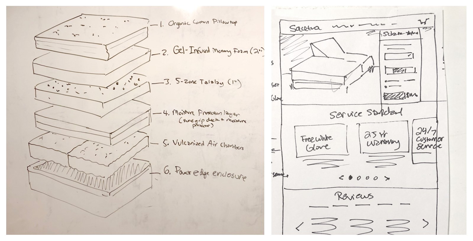
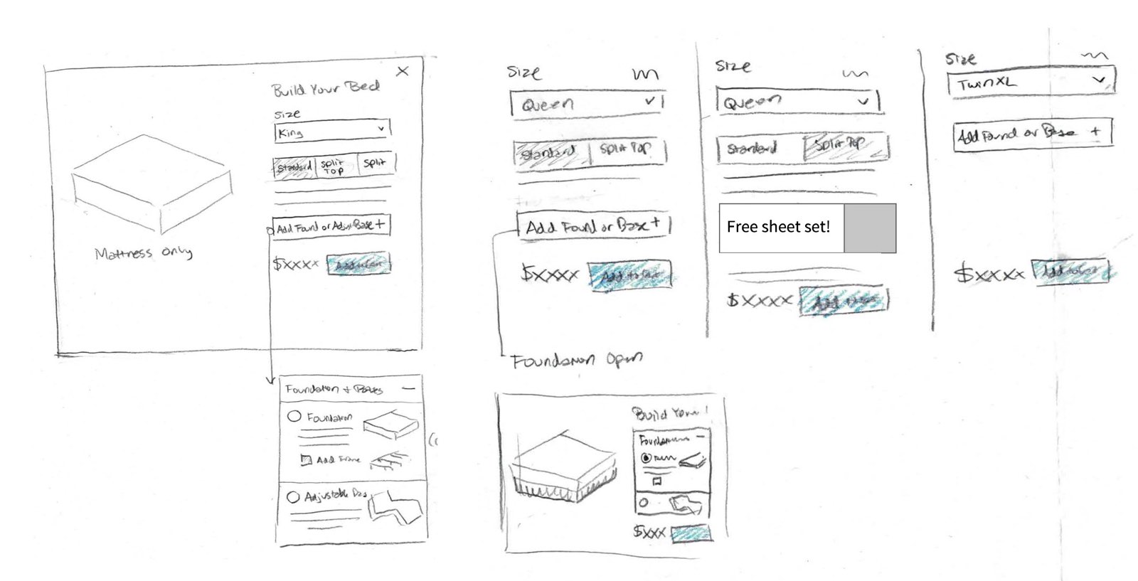
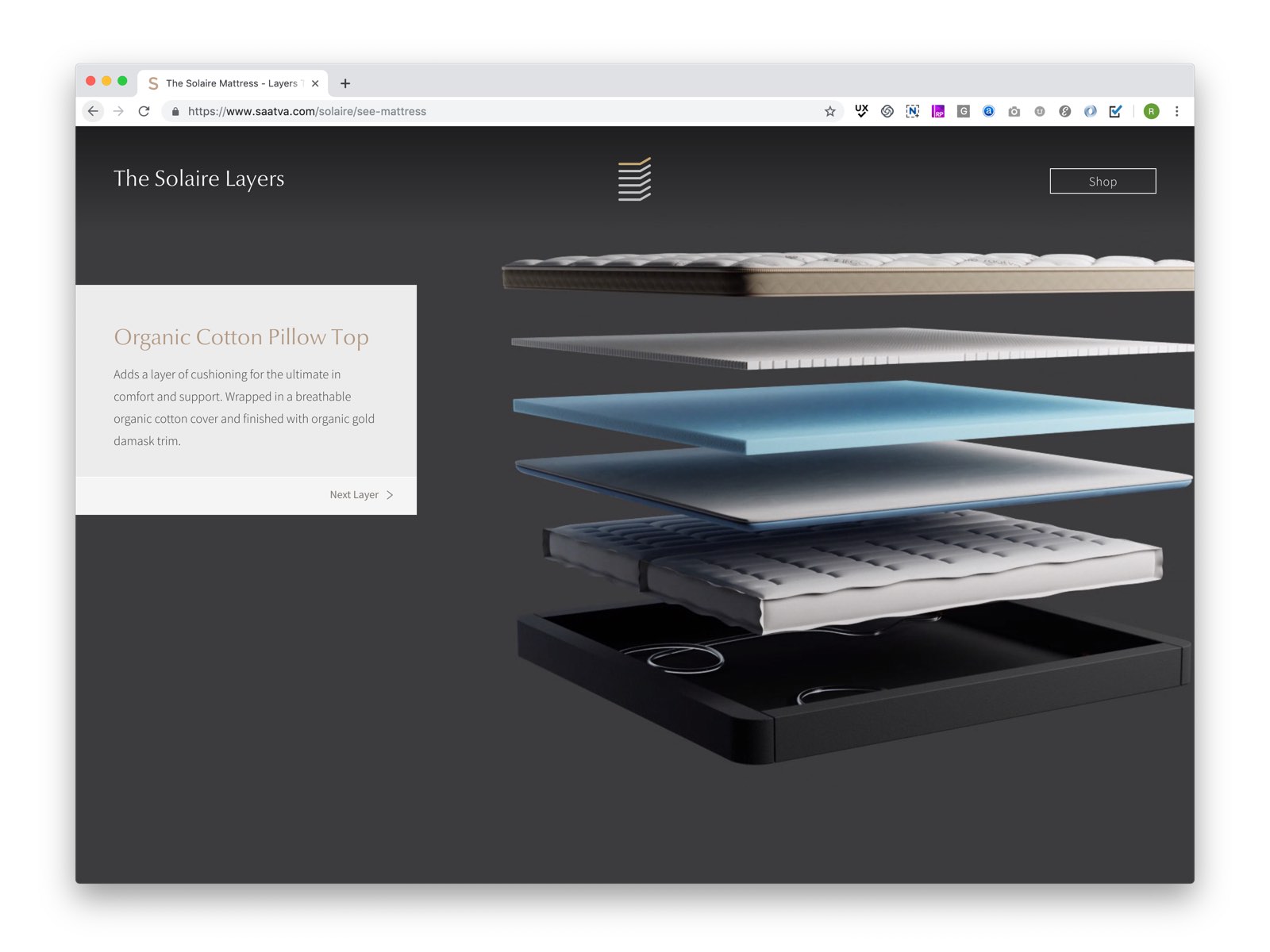
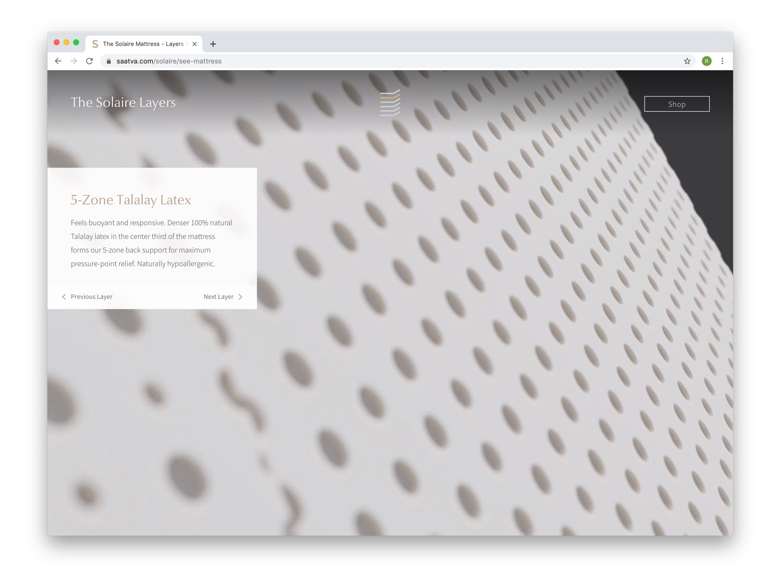
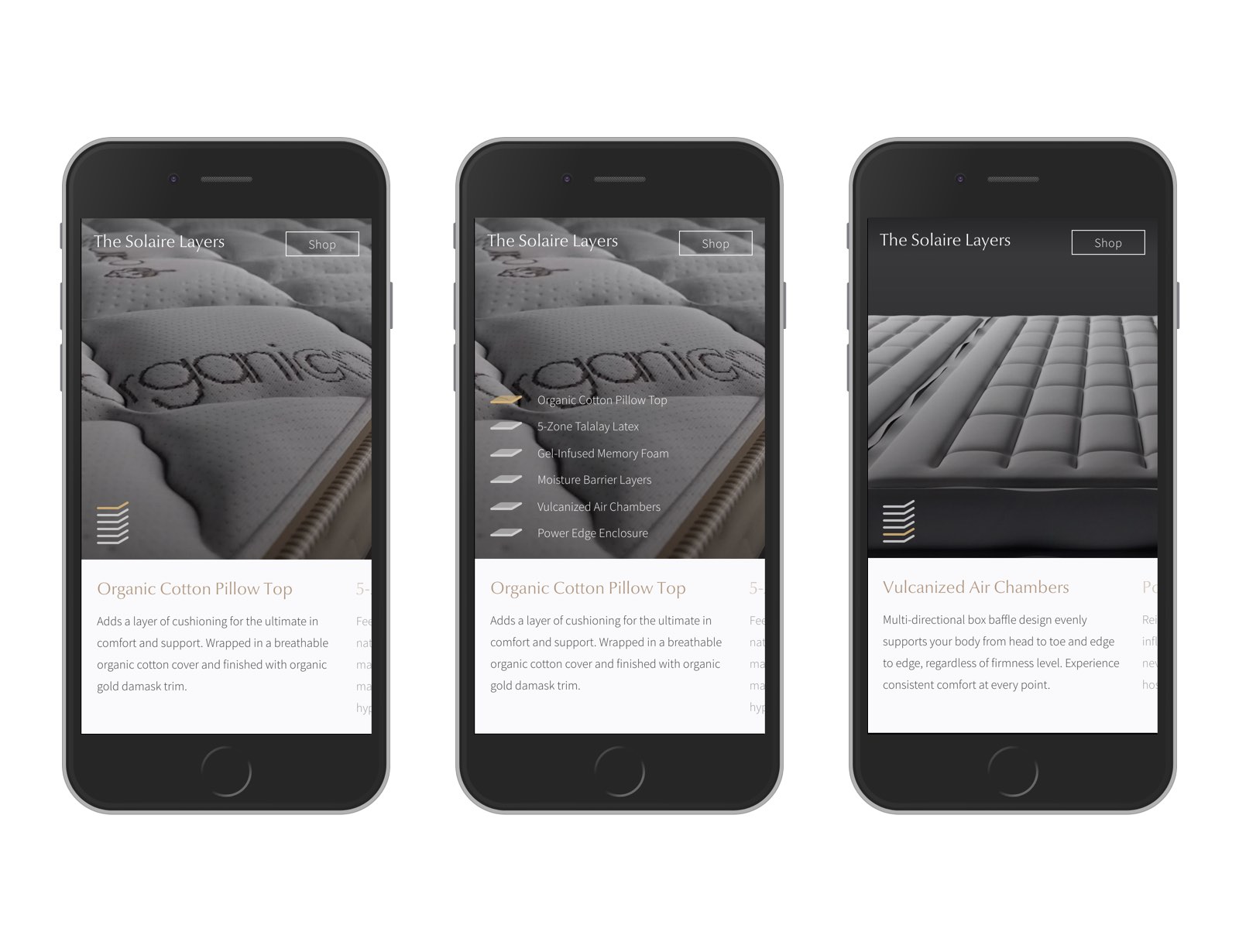
Informed by user test results from Saatva Mattress, we created a similar funnel for Solaire. Clicking on any ad or feature would direct users to a mattress content page, where they could learn about materials, features and construction before making customizations and adding to cart. As Saatva’s most technical product, we decided that the mattress diagram should be a full-screen, immersive 3D experience.
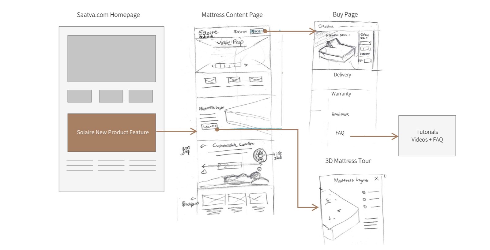
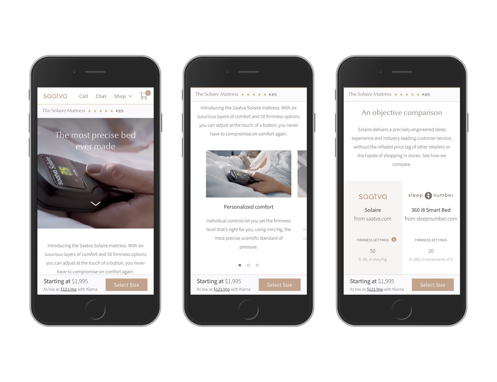
The Mattress Page
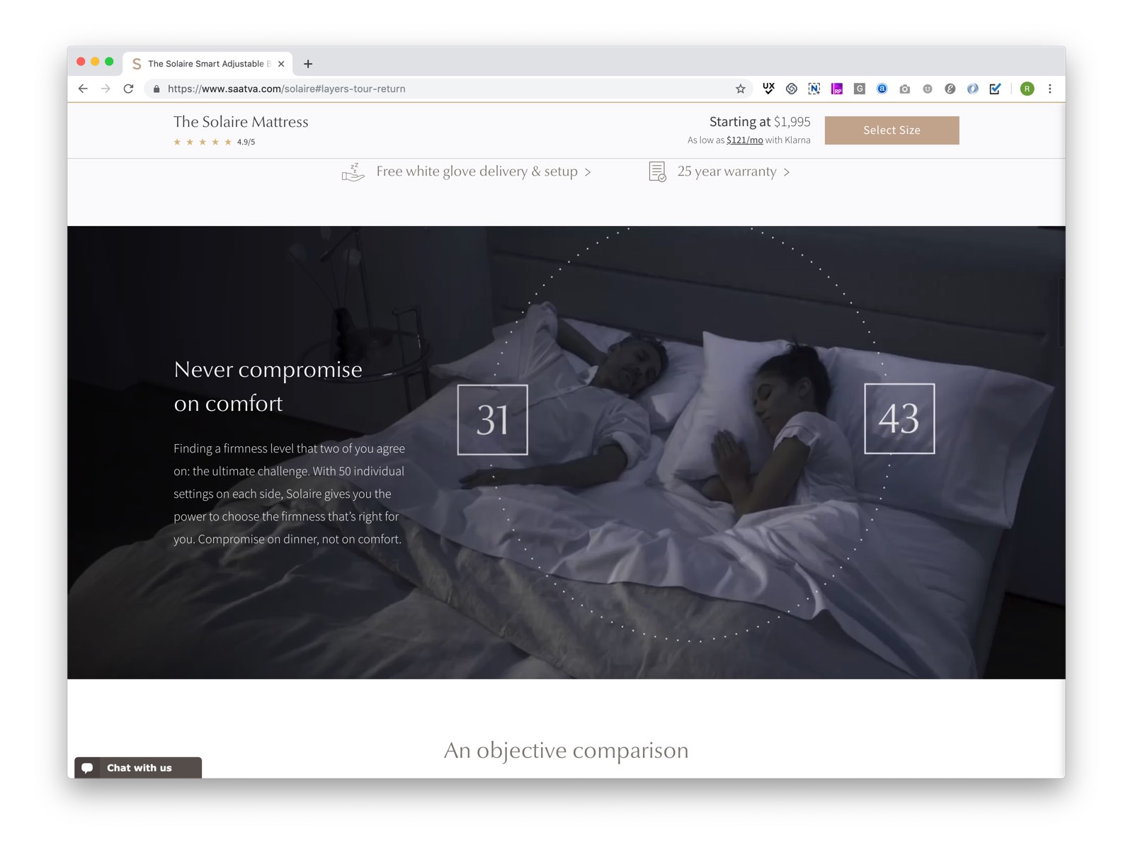
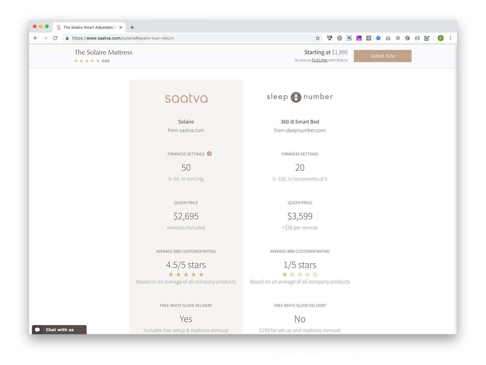
The page tells the full story of Solaire, from customizable comfort, to its expert engineering. From past user interviews, we knew customers would do their own comparison shopping, so we included a robust comparison to Sleep Number so they can see how the Solaire stacks up.
The 3D Tour Page
Users reach the 3D tour page via a feature on the mattress page. As the user clicks or swipes, she goes from one layer to the next, learning how each contributes to her comfort
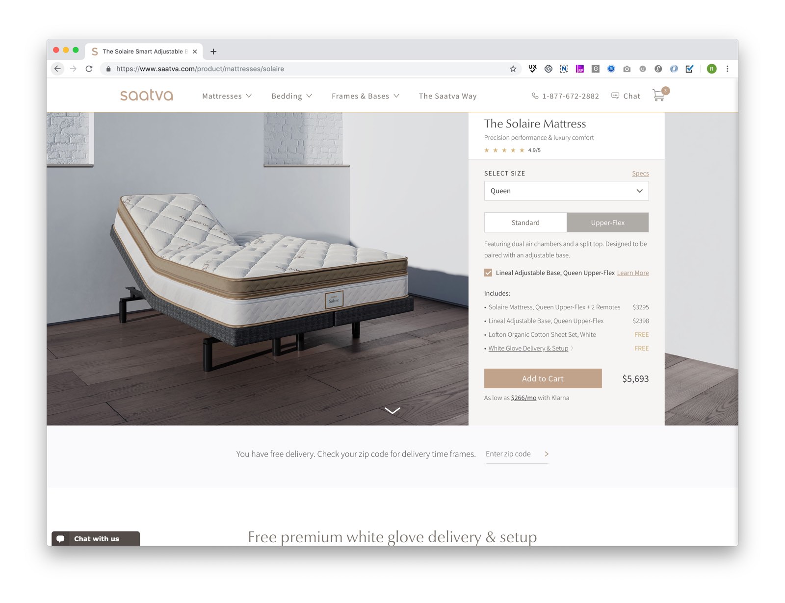
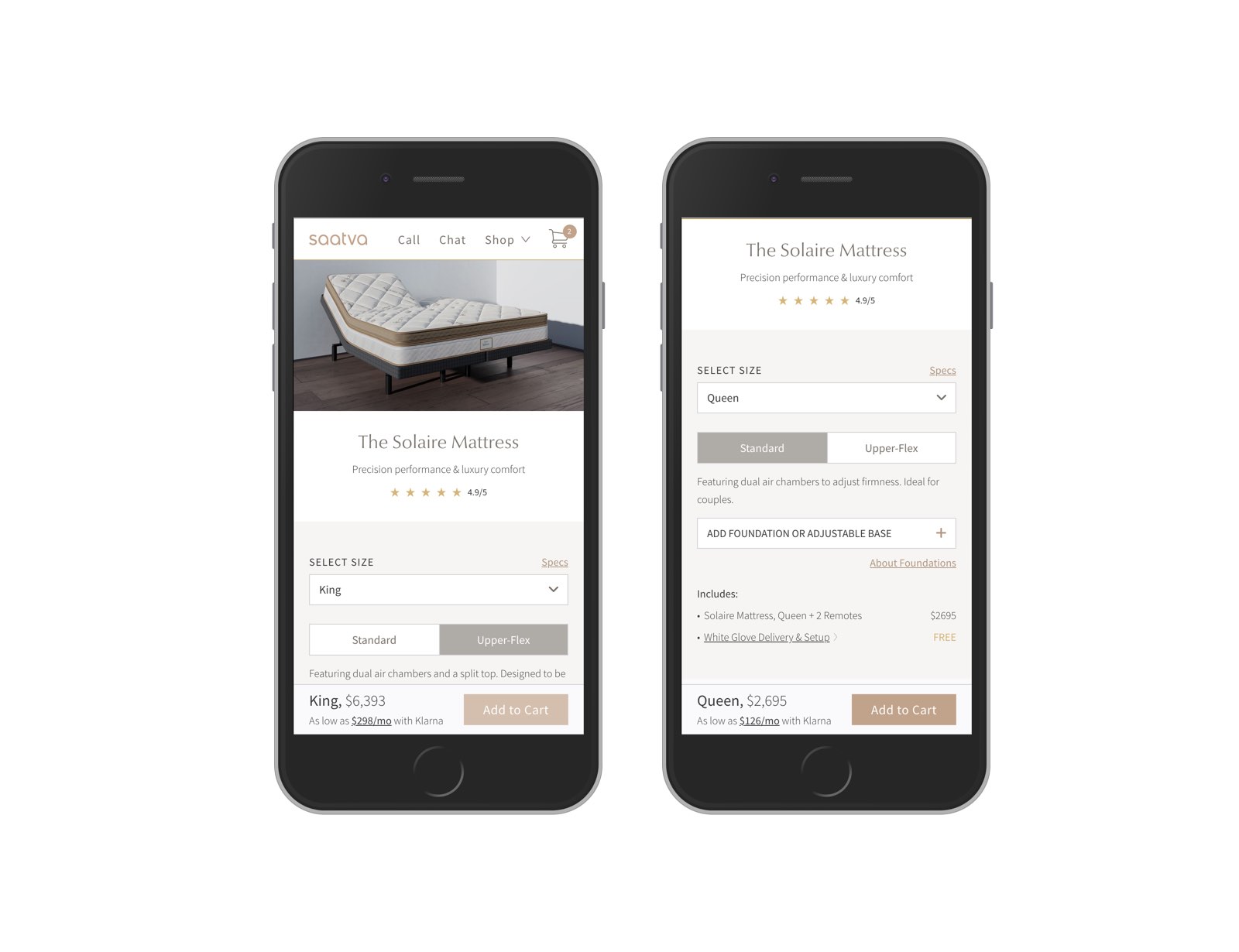
The Shop Page
As we did on other pages, we were able to leverage previous user insights create the best possible shop experience. In our Saatva Mattress tests, several users were expecting the product image to change based on the options they had selected. Many were confused by what they were seeing. This helped unlock a major insight: the product panel image had more informational burden than originally anticipated. We were able to accommodate this need head-on with Solaire. Shop configuration shots directly reflected what the user selects. We were able to do this by utilizing 3D rendering to showcase every configuration. Users would be absolutely clear on what they were getting and what is included.
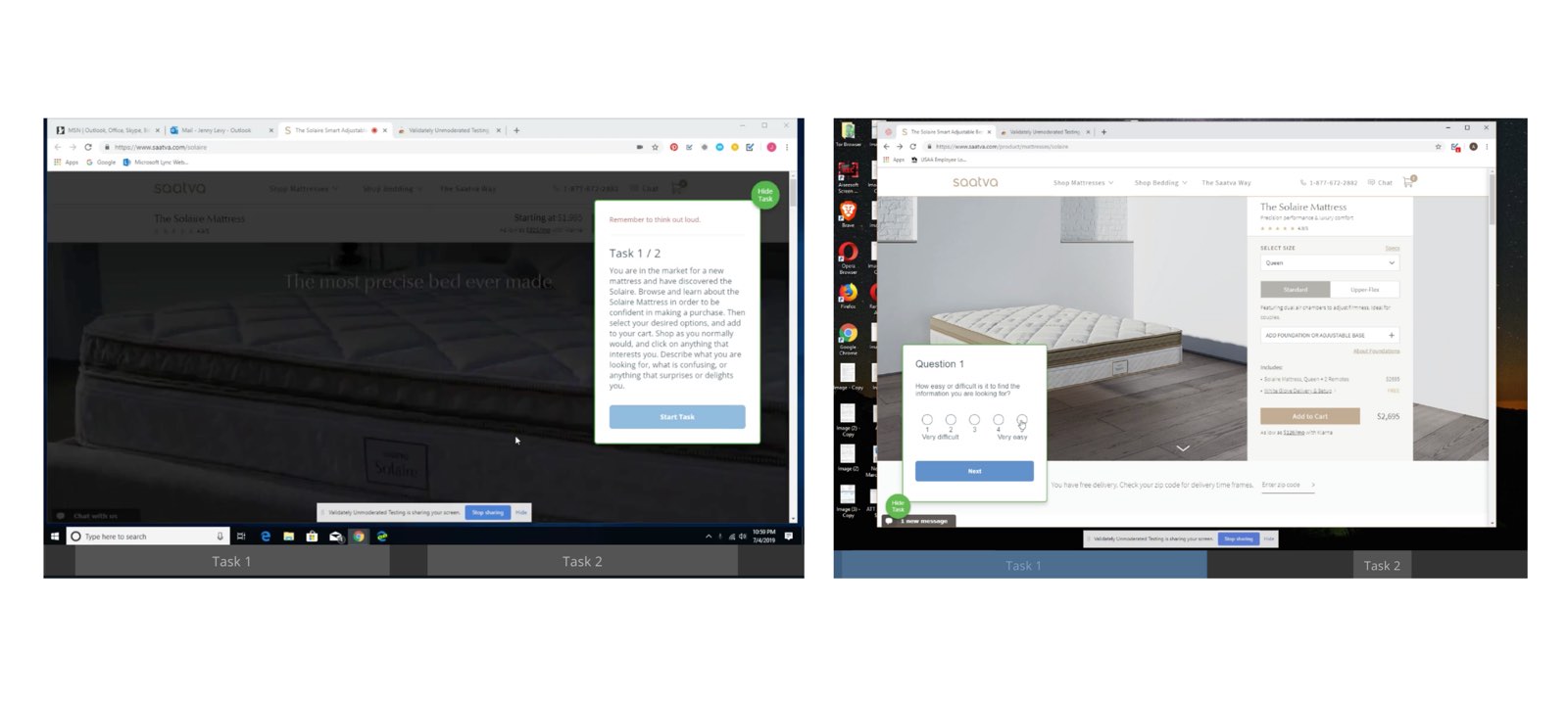
Monitoring Performance
I examined engagement metrics relative to similar pages in the Saatva ecosystem to see how Solaire compares. I found that time on page and on site is healthy, and that converting users spend the majority of their time on the product page. This indicated that users may not be scrolling and engaging as much as they could be on the mattress page. We decided to investigate further with a usability test.
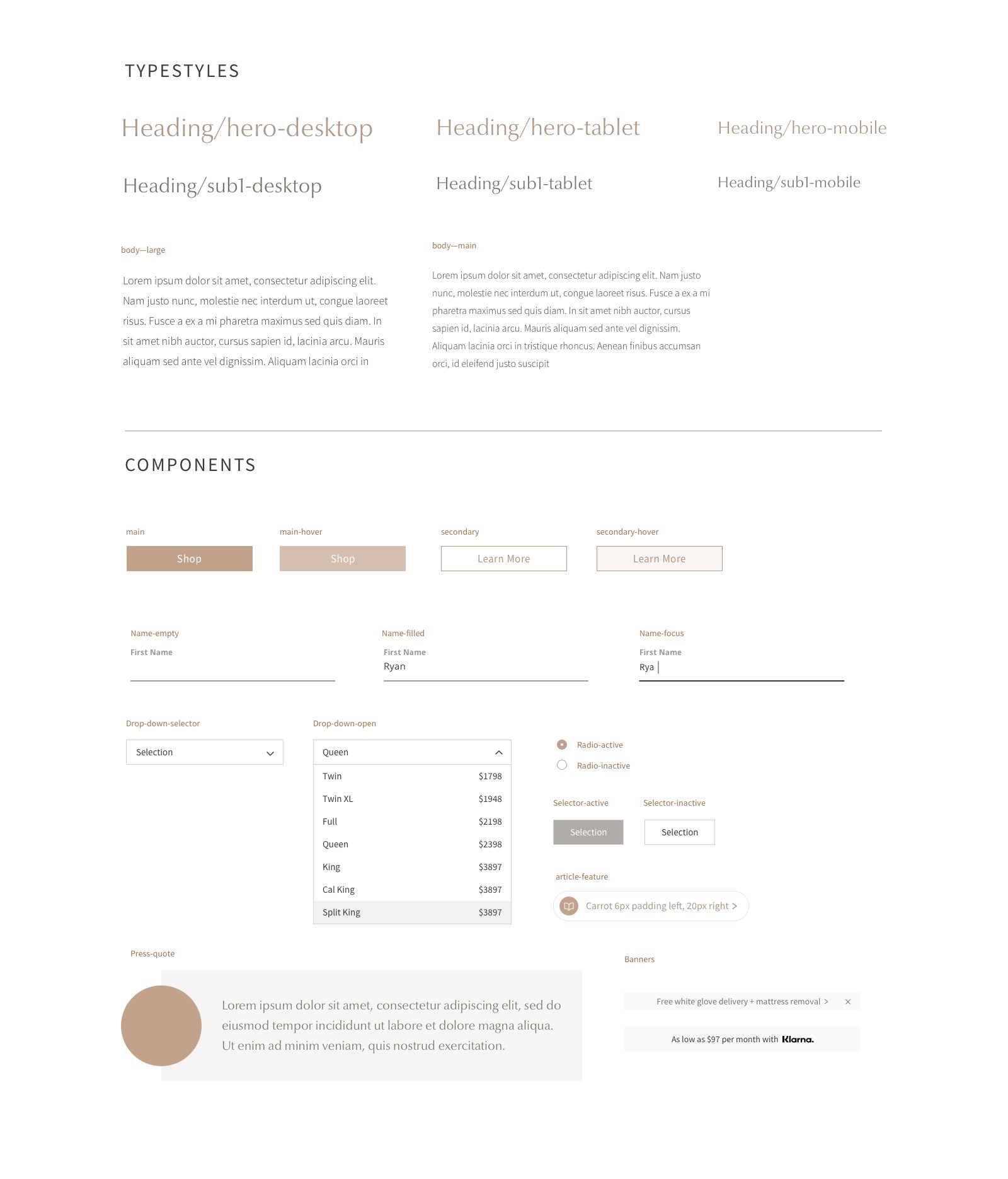
The Design System
Solaire was one of the first launches on Saatva.com to fully utilize our new react component library. With each new launch, we have been getting faster and faster because of it.
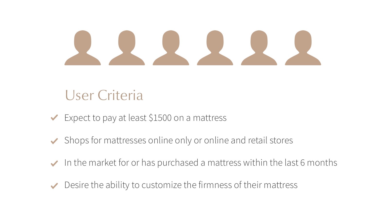
User Testing and Looking Forward
In order to optimize the Solaire experience, we ran an unmoderated remote test. We targeted six users that expect to pay at least $1500 and desire the ability to customize their firmness. The goal was to understand if users are informed to make a purchase and if the configuration process was intuitive. A few themes emerged in the results:
Scrolling continues to be an issue for desktop users—some users did not scroll fully on the mattress and shop pages. Most users did not click on modals, and most did not click on the 3D tour. This confirmed that in future iterations we need to add scroll guides and increase accessibility to the 3D tour page by having it available in sub-navigation or feature it more prominently. I also recommended that we drive traffic to it as a landing page from affiliate sites, where users are already familiar with general Solaire features.
 VIEW ALL UX & PRODUCT